Branding • Graphic Design
Meurette & Persillé is a typical Burgundy restaurant in the heart of the Village Gastronomique at Dijon's Cité International de la Gastronomie et du Vin. Chef Florent Colombo is committed to offering authentic, gourmet and generous cuisine, highlighting local produce and featuring dishes emblematic of Burgundy.
My role for this project was to design and implement a logo and graphic charter for the restaurant.
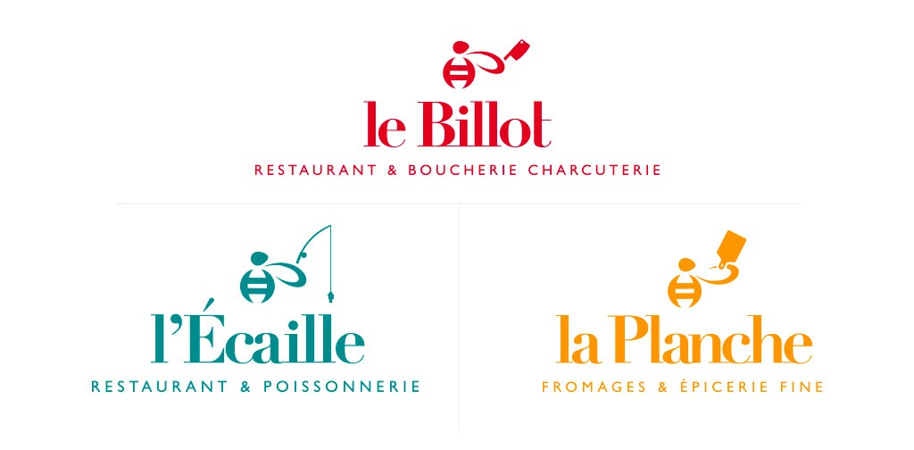
My first proposal is in line with the graphic charter already present in the logos of the other Village Gastronomique brands. Indeed, the Village in which the restaurant is located represents a grouping of the best of the French food trades. There's a butcher's shop, a fishmonger's, a cheese shop, etc. All these different entities have one thing in common: a bee. The bee is the emblem of the Village Gastronomique. That's why it's used in different ways in each logo. What's more, all the logos use the same typography: “Didot”.
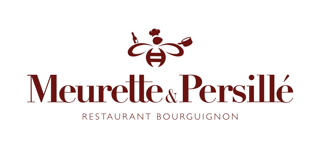
I therefore reused these different elements for my first logo proposal, using the “Didot” font for the lettering and reworking the bee to fit in with the restaurant's theme. This proposal was chosen by my client.
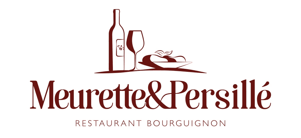
For my second proposal, I was looking for a logo that would combine “modernity” with “authenticity”, “gastronomy” and “generosity”, all key concepts in the restaurant business. To achieve this, I chose the “Soria” typeface, which I reworked to suit my needs. I chose this typeface because of its roundness and curves, giving my logo a “sweetness/greed” feel. When I reworked the logo, I made some of the letters join together to suggest a spirit of togetherness and conviviality, which are hallmarks of Bourguignon meals.
For the icon, I wanted to reuse the concept of the curve so that the typographic logo and its icon were in harmony. This also gives the logo icon a simple, modern look. Finally, I wanted to incorporate a bee on the wine bottle label to ensure that even if the logo is different, the restaurant is still a full-fledged member of the Village Gastronomique.
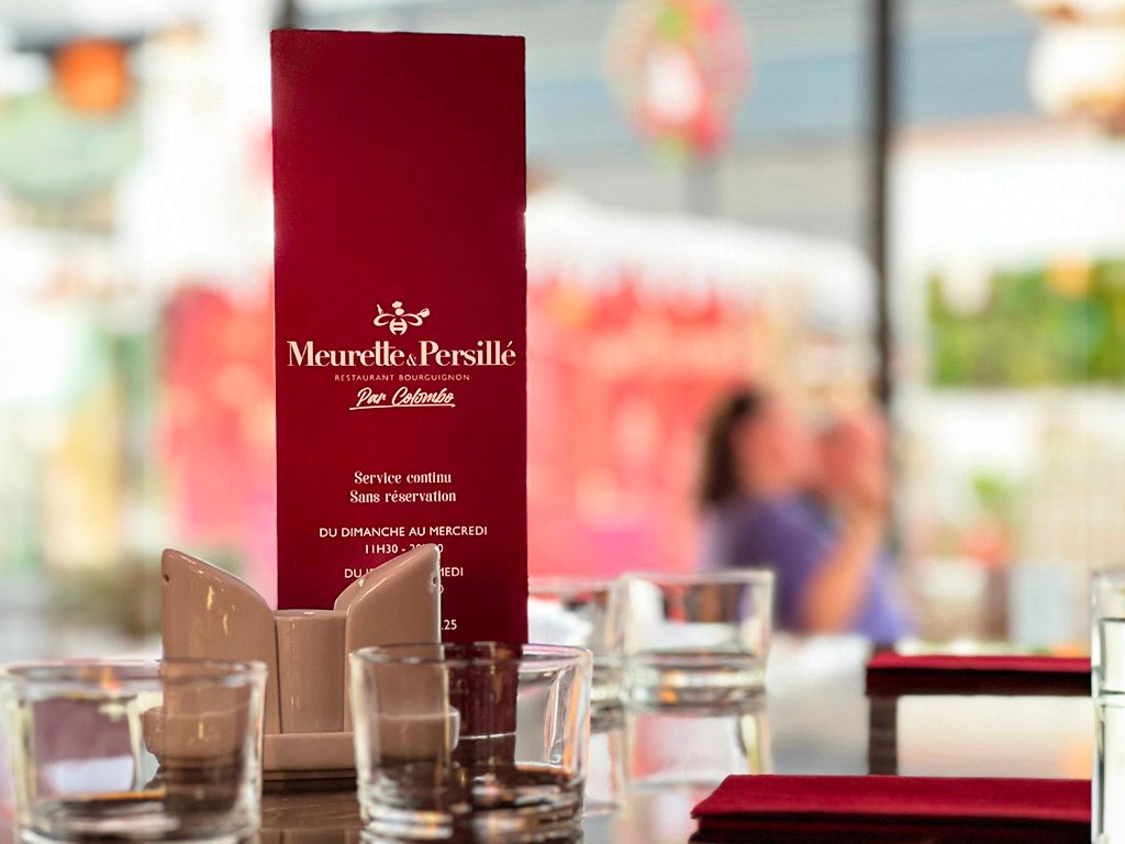
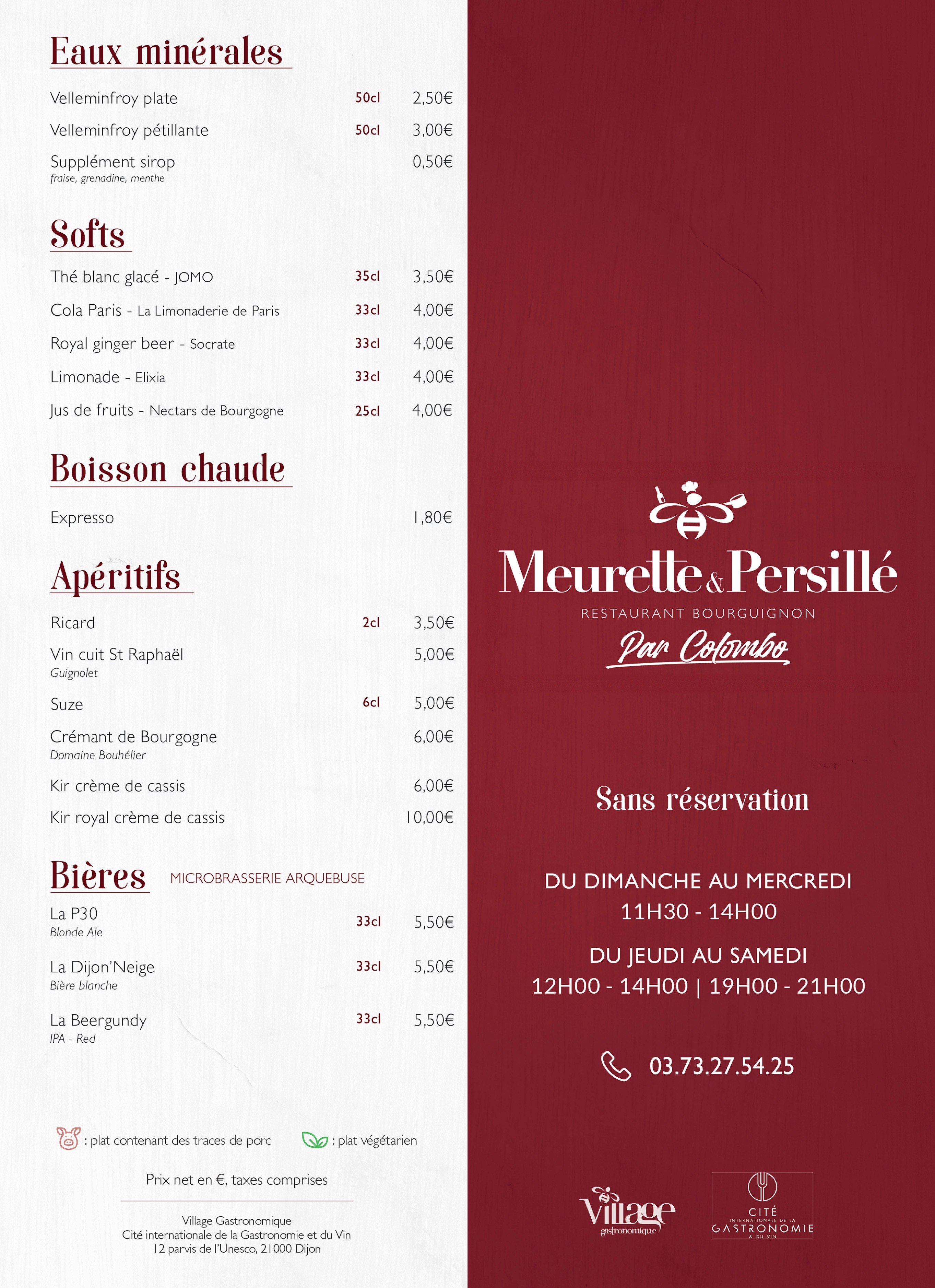
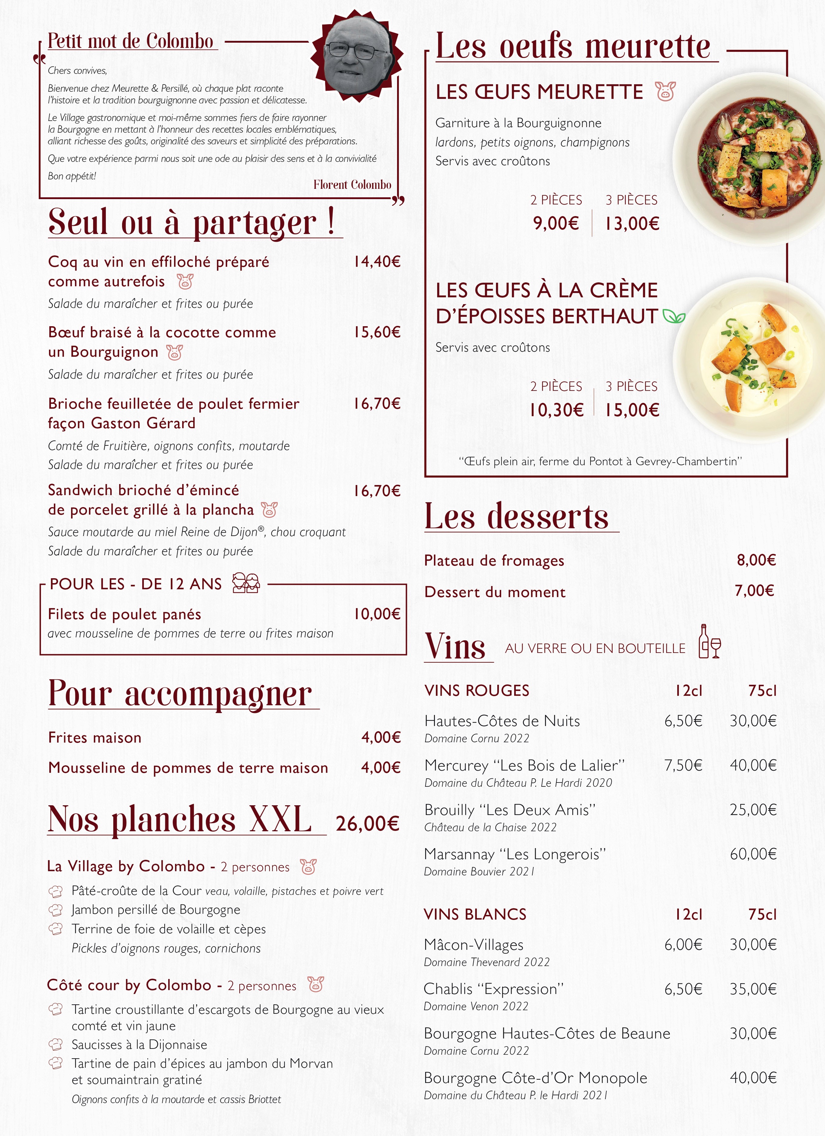
For all the materials related to this new restaurant (posters, menu, etc...) I decided to use the “Soria” font for the title, as for the second logo proposal, and “Gill Sans” for the texts.

© Copyright Clément Dupuy 2024